Pipe and Glass
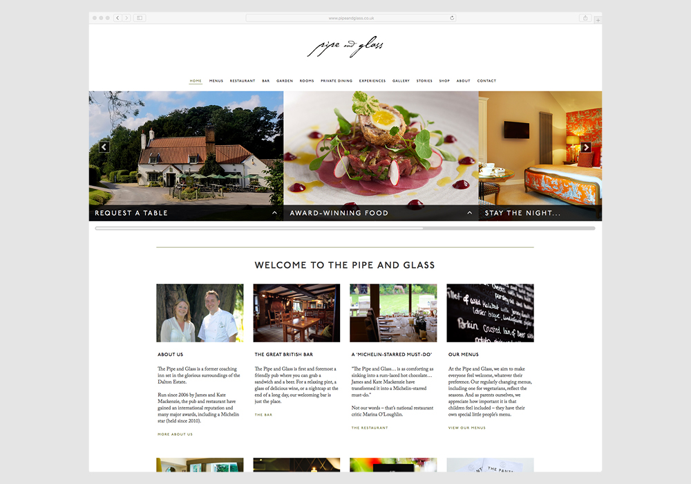
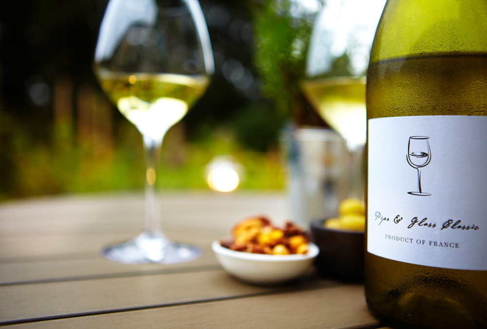
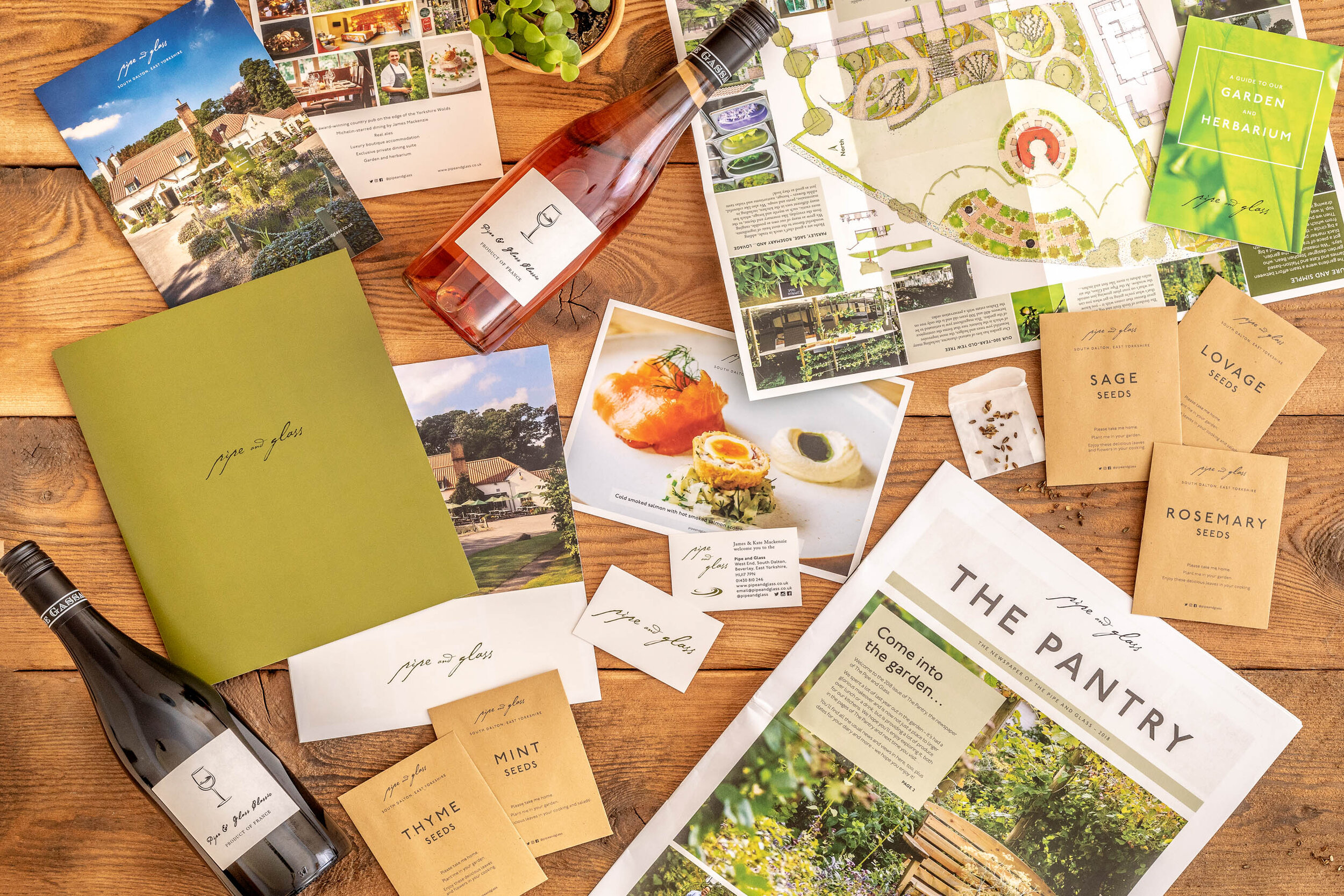
Considered a ‘Michelin-stared must do’ the branding needed to reflect this, whilst communicating the 'premium standard', without distancing it self for it’s country pub origin. The logo - a confident script logotype, laced with additional flourishes. The colour palette - a rich yet muted olive green. The typography, confident and clear, harkening back to traditional British railway signage.
Website
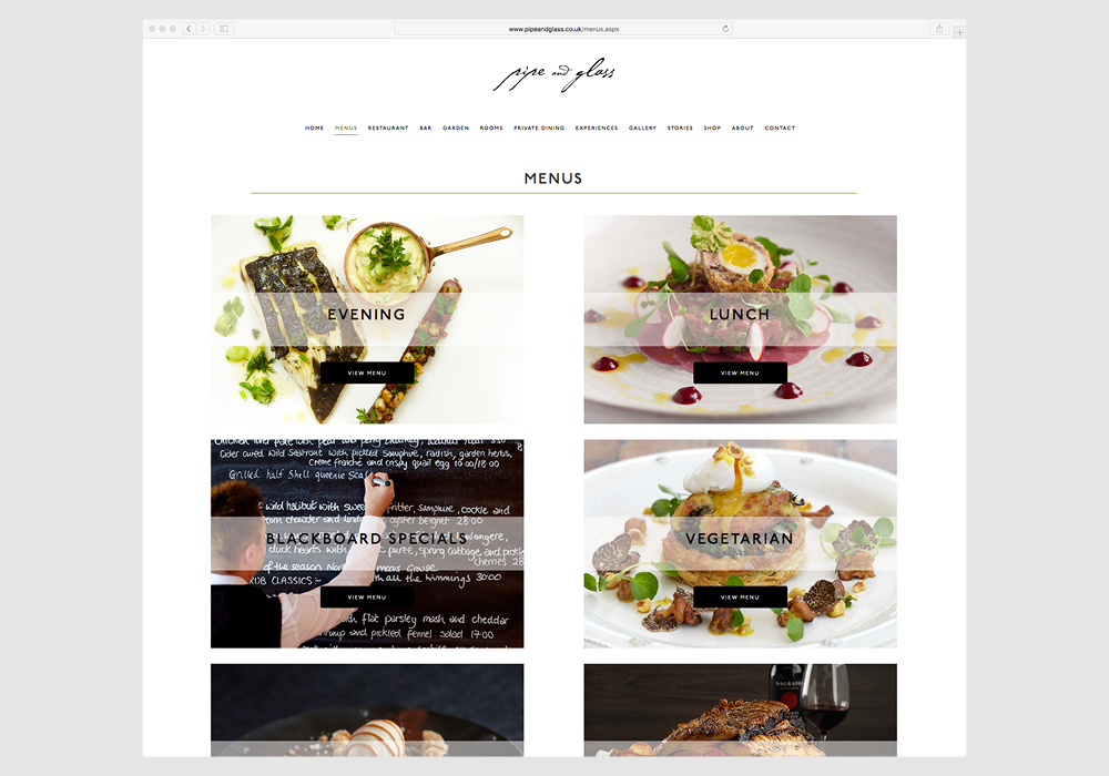
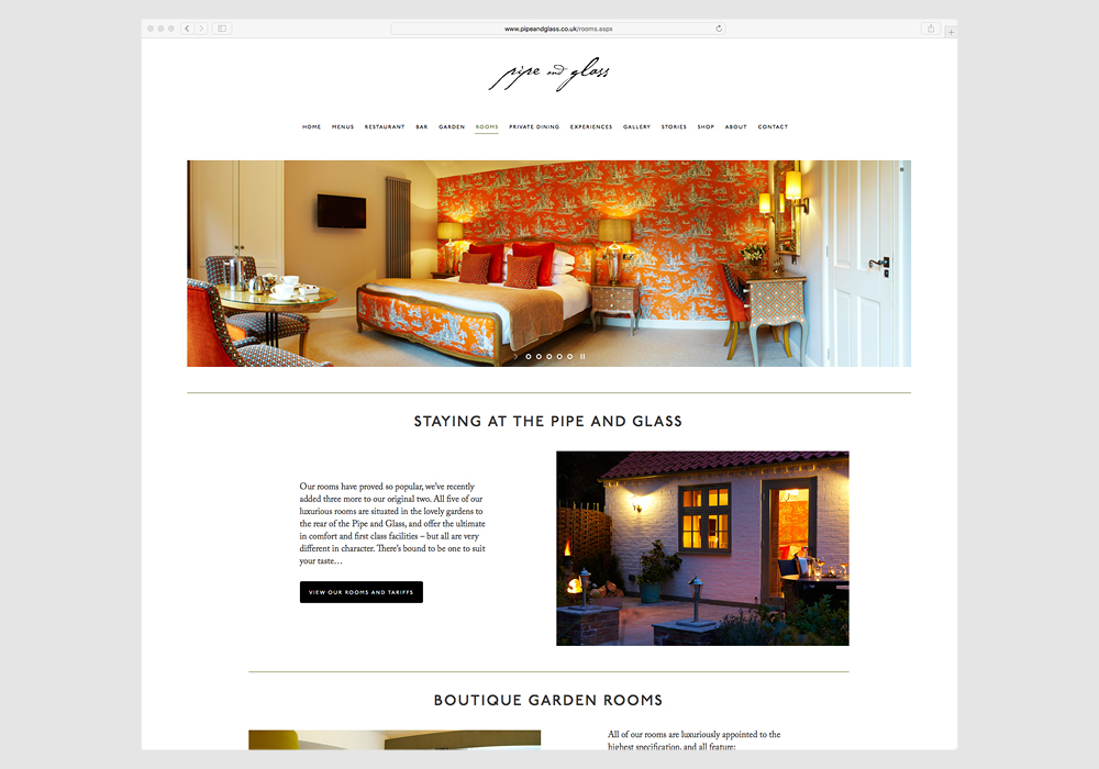
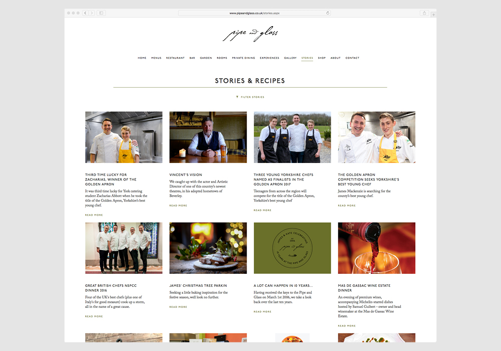
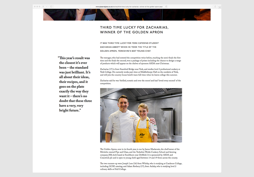
A fully responsive site with beautiful photography, typography. The site allows visitors to view menus, book a night in the boutique suites, read from the back catalog of ’Stories’ and keep up to date with all the latest going’s on from the Pipe and Glass.
This project was designed and produced whilst employed by Graphicpower.


